
How Apple Broke Call Waiting in iOS 7
I recently upgraded my iPhone to the new 5S and downloaded iOS7. I’m enjoying some of the changes (finally, automatic app updates!). But the other day, while driving to work, I experienced one design change that wasn’t just disappointing – it was downright panic-inducing. I got a phone call while I was on another call. I glanced down at my phone and was confronted with this screen:
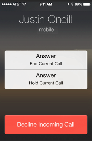
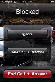
Huh? Quick - which button do I press to answer the call? I felt the pressure begin to build. I tried to keep my eyes on the road while reading the small print on both the “Answer” buttons. By the time I’d finally made sense of my choices, my call waiting had already gone to voicemail. Had Apple even tested this new design at all? My initial confusion with this screen hasn’t improved over time. These buttons trip me up every time I see them. Answering my call waiting – a common task I’ve never had problems with – now causes me to panic, especially if I’m driving. Let’s look more closely at the old screen and its wordy, flattened replacement.
Why was the old design so much better? Here’s what Apple did wrong in their new design:
-
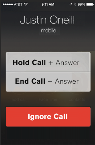
The options look too similar. The top two buttons are both titled “Answer.” They look identical at first glance, requiring users to read the small text in order to distinguish between them.
-
There’s too much text! The old design used fewer than half the words to present the same three options.
-
It’s too easy to accidentally end my current call. The “End current call” option is listed first, is no longer red, and could easily be mistaken for the “Hold current call” button. Apple’s designers seem to have changed their minds about which option they think people will use the most. I can’t speak for everyone, and I haven’t seen their research, but personally I’d rather ignore call waiting rather than accidentally hang up on the call I’m already on.
What Apple got right:
-
The grouping makes much more sense. I do like that that the new design groups the two “answer” buttons and separates them from the “decline” button.
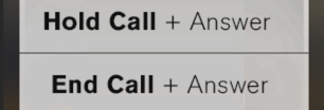
Here’s how I’d improve the new design:
Here, I’ve emphasized the differences, not the similarities, between buttons. I’ve kept the text large and readable. And I’ve kept the words to a minimum. My advice to fellow designers: Imagine people using your product while they're distracted, multi-tasking, or in a hurry. How can you use color and text to make all the options clear in a single glance?