Three Step Home Pages
I've noticed a trend recently of home pages for various web services having a three step layout. The goal is to describe your service with three simple steps. A few examples:
Sunnygram

Blurb

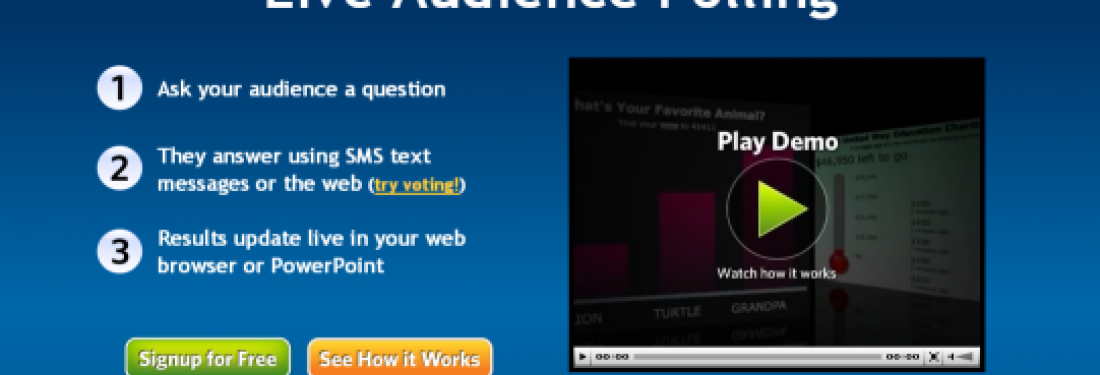
Poll Everywhere

This pattern is becoming pretty rampant and with good reason -- it's effective. If you have a site that is providing a service in a new or unique way, you need to explain to your prospective customer why you are special very quickly. I can't even tell you how many sites I visited in the course of doing research for this article that I could not figure out. The three steps design approach provides a framework for communicating uniqueness in a clean, simple format. For example, screenshotted below are two sites that do very similar things -- ticket search. Fansnap uses the three steps approach to describe what they do and why they do it better than others. Seatwave highlights an event at the top and then provides a browse interface below. [more538] Fansnap does a better job educating their visitors about what is so special about their ticketing site. In contrast, Seatwave is just another ticket site -- I'm not sure why I would use it over eBay or StubHub which are more well known.
Fansnap

Seatwave

But is three a magic number? Why not four steps?
Four steps starts to feel like a lot. Let's look at this four step example from LOVEFilm.com -- the British version of Netflix.
LoveFilm.com

Four steps starts feeling complicated -- I can't just scan and move on. Do they really need that third step --"Watch it at your leisure with no late fees"? It seems like they could combine it with step 4 pretty easily. Then maybe they could have a big sticker or something that says "No late fees!" Check out this super quick redesign I did reducing the steps from 4 to 3:
Before - 4 steps

After - 3 Steps with a No Late Fees sticker

2 Pitfalls
As with every good pattern, there are ways that you can mess it up:
1. Avoid empty sound bites
In the quest to have 3 catchy pieces of information, don't reduce your something to nothing but buzzword fluff. Fansnap is trying to be clean by sticking with three words: Compare - Choose - Click. But, on first glance it's a little confusing what they are talking about and why they are unique. Basically, they search across a bunch of sites (like kayak.com except for tickets) and then offer a cool UI to compare the seats so that you can get the best seats at the lowest price. Handy. Here is a redesign of the language and graphics that keeps the simplicity but doesn't force the user to think:
Before - empty language

After - clear languag and graphics

2. Put the numbers close to the words
In the original FanSnap above, the numbers are buried in the graphic. This makes me wonder at first if the items below are steps or just three features. In the redesign I've put the numbers next to the words and suddently it is clear that this is a quick, fun process. So, to make a long story short, three steps is an interesting design pattern for quickly communicating the essence of your service to your prospective customer. Next week, I'll delve into the sister pattern of 3 steps which is 3 features.