Watch Out for Wearables: Google I/O Recap
Since 2008, Google I/O has been a developer’s conference, a venue for launching APIs, toolkits, and operating systems. 2014 was different: Google announced I/O’s first ever “design track,” and they invited Sliced Bread to come take a look. So Mia, Julie, and Molly spent two days fiddling with multi-device interactions, squinting at watches, debating colors, fonts, and animations, and talking shop at the Moscone Center in downtown San Francisco. Read on for their conference takeaways, their new favorite techniques, and one thing Google needs to do in order to keep attracting designers to I/O.

Mia O'Neill, Managing Design Director
Mia gets coaching on her putts from Google Glass. She almost makes Glass look cool...
What were your top takeaways from Google I/O?
- I was initially disappointed to hear that I/O was focusing on wearables this year. I haven't worn a watch in 10 years (isn’t that what my phone is for?). But, by the end of the conference, I couldn't stop thinking about all the interesting possibilities for wearables. They’re not for everything: the really interesting use cases for smart watches have to do with specific activities like running (taking advantage of built-in motion sensors and heart rate monitors) or even cooking (I loved the All The Cooks Recipes wearable app).
- Learning about the motion patterns in Material Design renewed my excitement about the importance of animation. At Sliced Bread, we animate our prototypes using JavaScript, with help from libraries like jQuery and GSAP. Making motion and interaction a priority is certainly more challenging and time-consuming than building static pages, but it’s worth it; animation is integral to the product experience, not just the icing on the cake. It was gratifying to hear Google echo our convictions!
What did you add to your design toolkit?
- Google designers demoed a few examples of how they use Adobe Edge Animate, After Effects, and Framer.js to prototype motion in their designs. Molly and I both heard a lot about Framer from designers outside Google. It’s not a Google tool, but it seems like a great way to prototype the complex motions and animations that the new Android platforms demand.
- I’m going to subject all my mobile designs to a jiggle test. What’s a jiggle test? During the session on Designing for wearables, designer Hayes Raffle showed two watch screens side by side. Both interfaces looked tidy and clean to me. Then he jiggled the screens… and it became instantly clear that the UI on the right was much clearer.
- We all know that mobile apps need to deliver just enough information, but this is doubly true for wearables: extra information really gets in the way when the screen is small and possibly fast-moving. Interactions with tiny screens should be as short, simple, and streamlined as possible. (I really wish Apple had performed this test when they redesigned their call waiting feature in the first version of iOS 7!)

Julie Stanford, Principal
Google Glass counts Julie's squats – and keeps track of her form. Glass didn't figure prominently in this year's I/O, but it did make for the best photo ops.
What were your top takeaways from Google I/O?
- I’m not the sort of person who likes sitting in a dark room discussing the philosophy of drop shadows, so the initial presentation of Material Design was a little too frou-frou for me. However, I’m impressed that Google finally got its act together around design. They gave both developers and designers a concrete, cohesive, and beautiful point of view about the look and feel of Android apps. I like the common sense approach behind their system: all background surfaces are made of “paper.” Each piece of “paper” is 1 dip thick, and it stacks, slides, and resizes. But paper on a screen can’t flip – it just doesn’t make visual sense. Consistently applying this logic is key to keeping the multi-screen experience from getting too crazy.
- Everyone at Google thinks user research is just as important as we do. This was clear in session after session. Finally, we can get to the business of designing stuff that actually works and stop arguing about the right methodology!
- If they’re done right, voice UIs can be so much more than phone trees. Companies like Tellme tried to implement voice UIs for consumers back in 2008, before the market was ready. Now, Google (and Apple) have a chance to pull off voice control – particularly in cars and on your watch. (Note that I’m only going to talk to my watch when I’m alone, thank you.)
- I was not excited about watches before this conference. Now, I can’t get them out of my head – the possibilities seem boundless. The really interesting use cases are contextual and ambient. My watch can alert me when I am at the zoo and it’s penguin-feeding time! Now that’s important!
What did you add to your design toolkit?
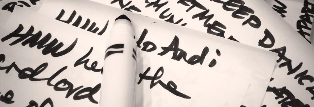
- I love using How Might We (HMW) questions, but I never used them as a form of note-taking while listening to user interviews, like the Google Ventures team did during the design sprint we attended. I’m still not excited about writing HMW’s while listening to users, but I asked my clients to write HMWs while sharing user stories with them from a needfinding study. It really helped clients think creatively and was a great adaptation of the Google Ventures technique.
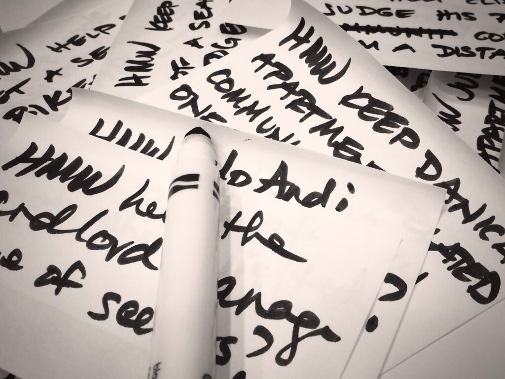
How Might We questions transcribed during a user interview during the Google Ventures design sprint.
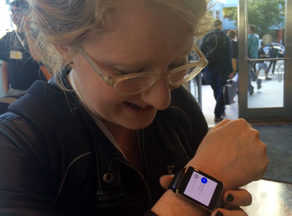
Molly Wilson, UX Designer
Molly tests out her new Samsung Gear Live watch. Her verdict: much more fun to design for than to wear.
What were your top takeaways from Google I/O?
- In the geek classic The Hitchhiker’s Guide to the Galaxy, Douglas Adams describes human society as “so amazingly primitive that they still think digital watches are a pretty neat idea.” Digital watches were dorky in 1979 (the year Hitchhiker’s Guide hit the shelves), and they haven’t exactly gotten cooler. The I/O giveaway this year was a pair of smart watches that feel way too clunky and chunky for daily wear. However, despite the fashion drawbacks, I came away from I/O feeling that design for simultaneous screens is a tough, exciting problem I can’t wait to sink my teeth into. If you’re using the same navigation app on both your watch and your mobile, what information do you need to see where, and how does interacting with each device change the display on the other one?
- Both Julie and I teach at the Stanford d.school, so we’re not exactly rookies when it comes to design facilitation. Nevertheless, I learned some fabulous techniques from the Google Ventures design teams. I loved their two-phase heat map voting (I’d always done just one round of voting). And I’m absolutely going to use crazy eights with my colleagues at Sliced Bread when we need fresh insight into a tough interaction problem.
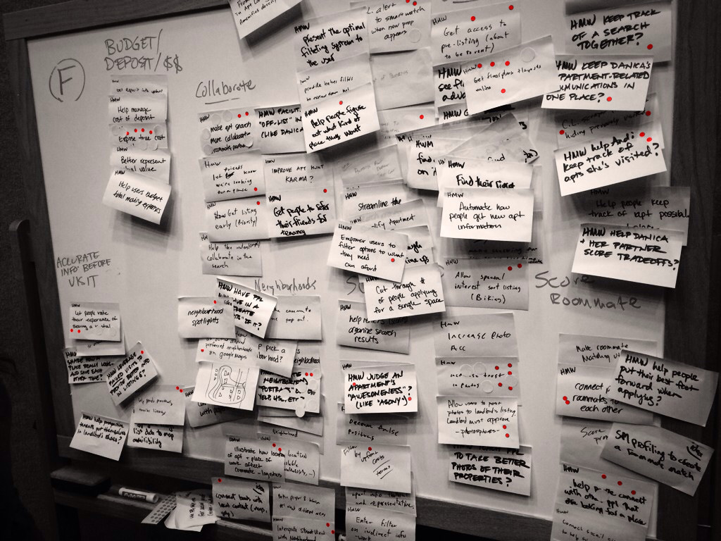
The small red dots create a "heat map" during the first round of voting on ideas; the larger circles (not colored) are from the second round.
What did you add to your design toolkit?
- Jenny Gove did a huge (119 people!) qualitative usability study of mobile websites. She extracted a bunch of principles about mobile website design and published an easy-to-digest whitepaper. Many of these principles are things we intuitively know, but Gove backs it up with hard data; it’ll be great to have in my back pocket when defending best practices.
Since this is Google’s first year of the design track, here’s our one big request: remember that designers’ workflows are different from developers’, and create prototyping tools for designers, too. In order to prototype on the watches we received, we’d need to bust out the full SDK. That’s just too much overhead given the quick, iterative way we work. Looks like we’ll be taping phones to our wrists until wearables allow for the rapid, janky interactive prototyping that will let us get lightweight feedback. Overall, we were impressed with what we saw. Given that this was only the first year of Google’s Design Track, we’re looking forward to seeing how Google will continue to expand and develop it further in the future.

Enjoying the afterparty at Yerba Buena. Not shown: Sliced Bread doing the silent disco really, really hard.