
Infographic: How much do employers pay for healthcare?
We’re excited to share the infographic we designed for the Intuit Health Benefits Center project to answer this question.

In July 2009, Intuit conducted a survey with over one thousand small business owners in California asking about the health insurance options they offered their employees and how much they were paying for health insurance plans. From prior discussions with business owners, we knew employers were very interested in finding out the results of this survey, as they wanted to remain competitive with other businesses in their industry. We decided that an infographic would be the perfect way to transform our huge collection of data into a single, compelling visual. Our goal was to create a comprehensive infographic that would be instantly meaningful and easily understandable to the many employers looking to get a handle on the best way to offer competitive insurance packages to their employees. Sound easy? Not exactly. Like most aspects of design, it turns out that creating infographics is a tricky business – on the one hand, we had to be careful not to present too much information so as to be overwhelming, but on the other hand, our infographic had to be able to provide enough detail to be useful to a wide range of employers looking for very specific information. And, of course, we had to do all of this without getting bogged down in the details or jargons of health insurance plans that often don’t make sense to someone at first glance who isn’t in the healthcare industry. [more538] Here are our top design principles for creating an infographic:
1) Focus the infographic around a single, key question
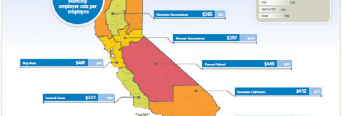
We centered our infographic around the fundamental question new small business owners cared about most: “How do my health insurance costs compare?” Then, to answer this question, we created an infographic design to breakdown some of the important specifics – like employer and employee costs by region, and the average employer contribution. We placed secondary information, such as the various plan types offered by employers, on the side of the infographic and used subtler visuals so it would not to compete with our key message.

2) Identify a visual metaphor to help expose differences quickly
We wanted viewers to be able to notice variations in data quickly, as this is the fundamental power of a good infographic. Consequently, we came up with helpful visual metaphors that allowed us to visually represent plan costs by region in two ways. First, we used a heat map of California to indicate employer costs so viewers could quickly see regional differences at-a-glance. Second, we displayed horizontal bars that corresponded to the relative costs by employers and employees per region so viewers could visually compare differences in amount.

3) Use minimal text, and rely on visuals to tell the story
We wanted to keep our infographic clean and simple by requiring minimal reading, so we included a visual key for our chart at the bottom of the infographic to help keep the text and fine print to a minimum.

Overall, our quest to create an effective infographic helped us to double-deliver to our client -- we not only revealed interesting findings, but also presented the findings in a ready-to-go format that met the needs of the employers Intuit wanted to reach. We’re excited to share our newest piece of healthcare artwork with you, so take a look and let us know what you think! https://benefits.intuit.com/content/infographic.pdf