2 minute guide to creating the perfect dashboard
At Sliced Bread we have seen and designed A LOT of dashboards. Dashboards for CRM, energy, IT, farming, social — you name it. Unfortunately, most dashboards we see out there fail the snooze test. They are just presentations of data that is available, rather than presentation of actionable data that is useful.
So, how do you create a useful, usable, meaningful dashboard? When you design your dashboard, it must do THREE things really well to be successful.
1. ANSWER A REAL QUESTION
Don’t display data just because you have it. This is the number one problem with most dashboards. Data should only be displayed on a dashboard if it is answering a real question that users of this dashboard actually have. For example, “You have walked 2,520 steps today” is useless data. Have you ever met anyone who has actually asked the question “How many steps have I walked today?” unless they are a professional shoe tester? The real question is probably “Have I had a good amount of exercise today for someone in my physical condition?” or “Have I walked enough today to overcome the chocolate cake I ate for lunch?” or “Has my walking today helped me reach my exercise goals?” Providing answers to those questions might involve analyzing data related to steps, but the steps data on its own is meaningless and boring. Most dashboards we see are more about data trivia than useful information because they are not actually presenting the right data about the right question. In fact, data is usually only interesting when compared to other known facts in the world that position the data contextually — for example steps compared to the average for someone your age, steps compared to your exercise goal for the day, calories burned in terms of chocolate cake, etc.. Before you start any design work, be crystal clear on the top questions users have when they arrive at your Dashboard and write those questions down somewhere big on your wall. And, by the way, the question “What data is available?” doesn’t count.
2. EXPLAIN WHAT IS GOING ON WITH THE DATA
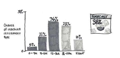
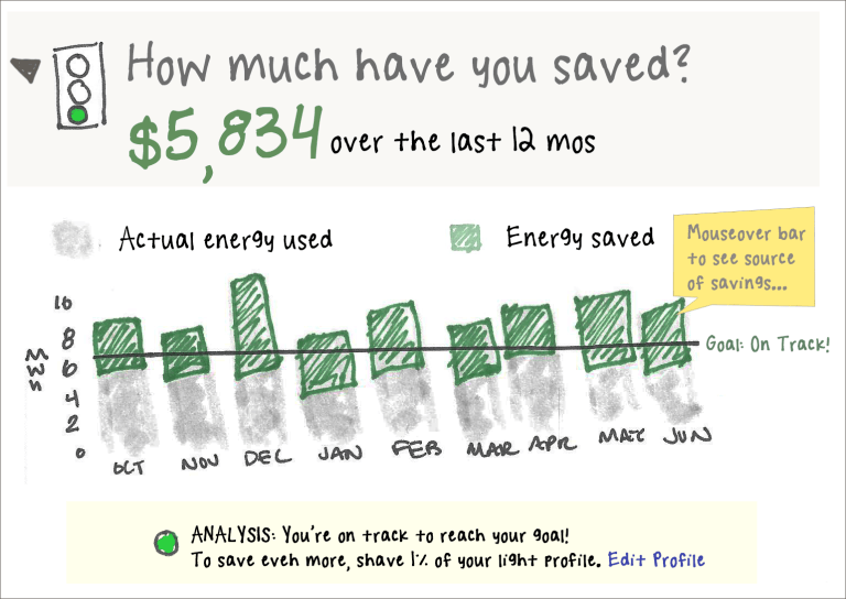
Fancy charts are great and can be very compelling for showing trends. However, fancy charts are even more effective if you pair them with a plain english explanation of what is going on. No one wants to think. One sentence that says what is happening is all you need. And, don’t forget to tie your explanation directly to the chart displayed. I used to work at a startup that provided investment advice about 401k’s to regular folks. The company came up with a chart to show the likelihood of having enough money to reach your goal. It was a fancy histogram that exactly 0% of people understood in user testing.
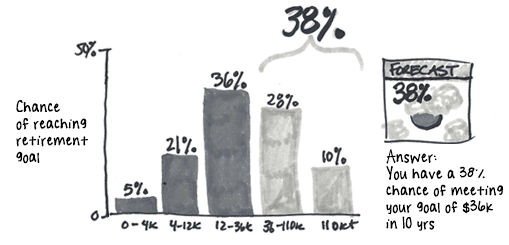
We added a simple bracket and plain text next to the histogram. Suddenly 100% of people we showed this to understood what was going on. Magic? No, just basic communication.
3. PROVIDE NEXT STEPS
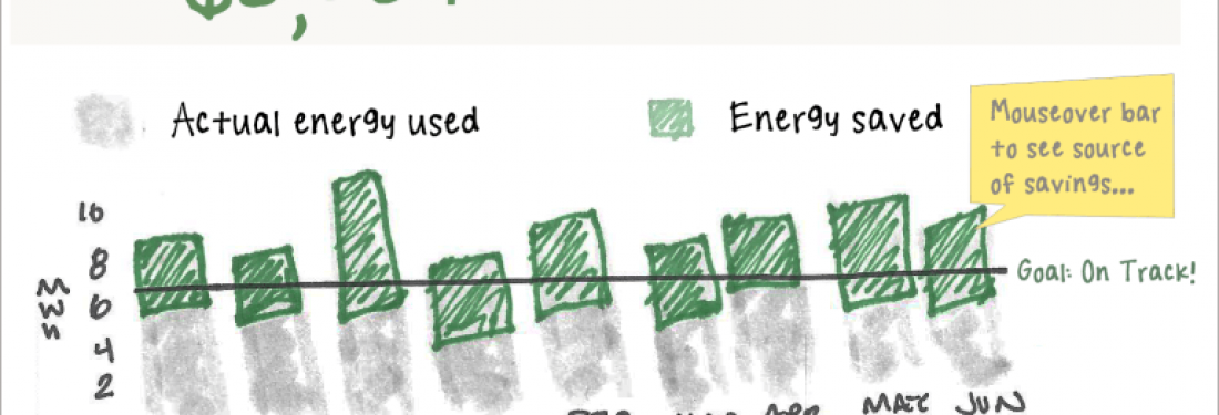
Actionable dashboards spur you to ACTION. You should predict what the most common actions might be after someone views your data and offer gateways to those actions. For example, truly interesting dashboards often tell you about something you didn’t expect. So, the next step after seeing the data might be to understand why this is happening. You could start answering the “why” question right there for your user or provide links for further exploration and explanation. For example, if you had a dashboard showing that energy use was going up and was higher than the same time last year, you might also explain that the weather was warmer than usual or that the air conditioner was possibly broken. These threads would help your user decide on next steps to address the data. You might offer links to other areas of your product, buttons to start workflows in response to the data, drill-ins that open up more information inline. Whatever. Give your user some options — OR ideally, do some user research and give your user the most common ONE option to help them down the path to action. DOES YOUR DASHBOARD MAKE THE CUT? Take a critical look at your dashboard. Does it look like this?
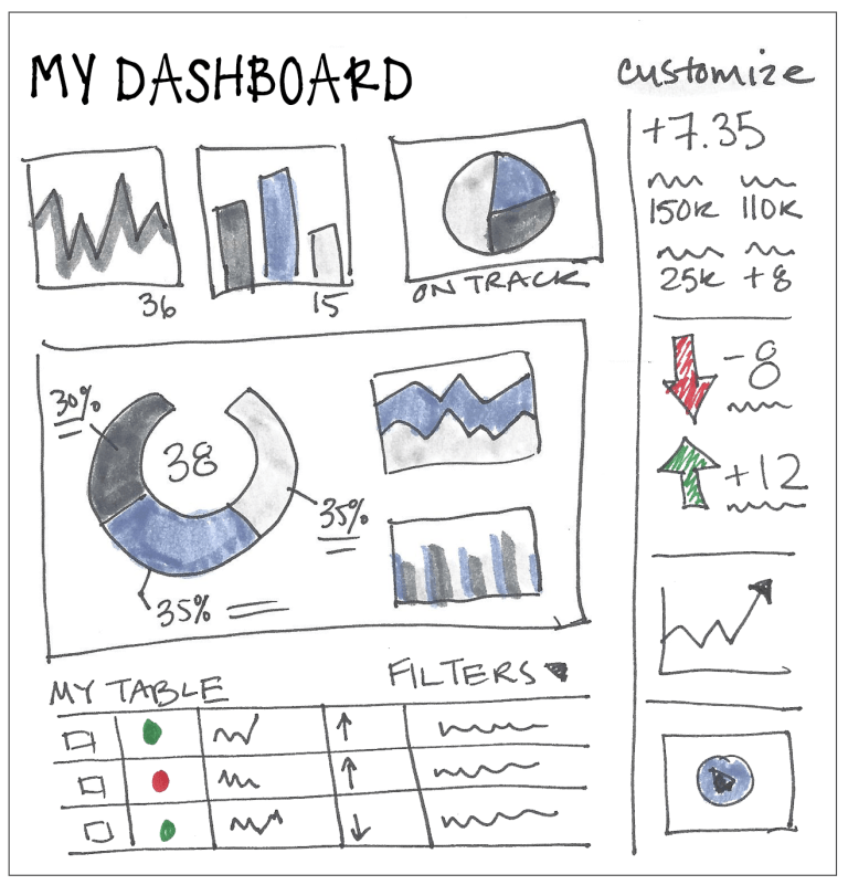
Or like this:
Make sure your dashboard answers real questions, explains the data, and provides next steps, and you will be well on your way to empowering your users with data.