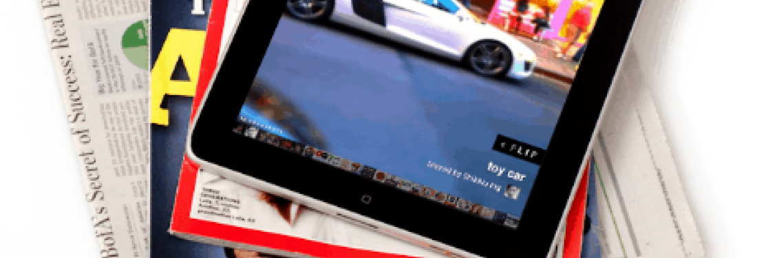
Flipboard: A tale of tough choices
I recently had a discussion with Mike McCue, the CEO of Flipboard, on how he and his team managed to get things so right with the Flipboard design. In particular, I was interested in how they were able to balance functionality with delightful, polished, user experience features. Mike’s answer was very simple -- they had to make some very tough choices and a lot of cuts. Their goal with Flipboard was to communicate to first time customers the potential of the product and have them yearning for more. Mike explained that when people used Flipboard for the first time, he wanted them to think, “Yes, I get it! And it would be even better if…”
Consequently, they cut all but the most important functionality for their v1. For example, Flipboard was a news reader but didn’t have full RSS on first launch; it only supported some predetermined feeds. Also, it had a Twitter reader but didn’t let you post tweets. These types of painful functionality decisions allowed time to implement the polish to the interaction that Flipboard is known for – gorgeous visuals, subtle animations and a magical, contextual user experience. Flipbooard’s goal was that people would become so enchanted by the experience on first use, that they would be willing to wait for more complete functionality in v2. This approach clearly paid off for Flipboard, but it’s a difficult one for many companies to embrace.
We frequently have conversations with clients who try to cut user experience features and polish in order to put in more functionality. Many of our clients ask us why they can’t have a product that works like an iPhone. If you remember when iPhone first launched, it also had all the polish and a limited set of features that were far less than current market leaders like RIM or Palm. However, by capturing people’s imaginations with amazing user experience, they were able to buy some time to round out their feature set in subsequent releases.
The lesson? Creating a beautiful, compelling, polished user experience for v1 takes guts. You have to be ruthless with your feature set and treat the user experience features as equal to the core functionality when planning your roadmap. We’ve often seen companies who have great design ideas cut those ideas at the last minute to squeeze in one more feature so it’s not a lack of ideas that’s at play here. It’s a matter of priorities.