
Blogging for the Government
Read Blog Post
Read Blog Post

Pattern Exploration: Carousel
Read Blog Post
Read Blog Post
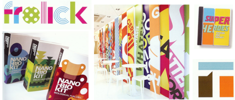
Trends in CommArts Annual
Read Blog Post
Read Blog Post
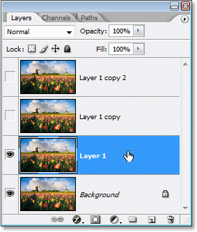
Name your layers (or styles)!
Read Blog Post
Read Blog Post
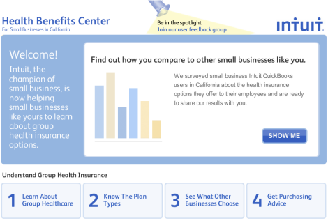
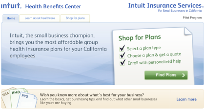
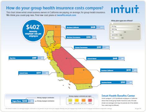
Launched: Intuit Health Benefits Center
Read Blog Post
Read Blog Post
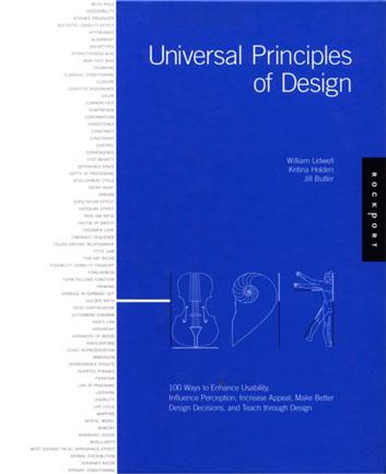
Universal Principles of Design
Read Blog Post
Read Blog Post

Pattern: Linking To Non-Web Documents
Read Blog Post
Read Blog Post
New projects: Yummly & iConstituent
Read Blog Post
Read Blog Post
Three Step Home Pages
Read Blog Post
Read Blog Post
Balsamiq vs. HTML Wireframes
Read Blog Post
Read Blog Post
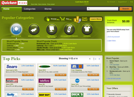
Launched: Quicken Picks
Read Blog Post
Read Blog Post

A/B and Qualitative User Testing
Read Blog Post
Read Blog Post

Fast Insight Testing
Read Blog Post
Read Blog Post
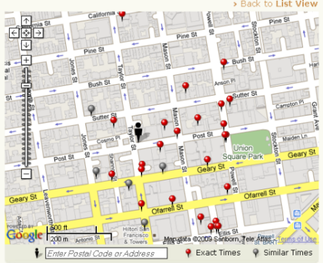
Open Table Mapping
Read Blog Post
Read Blog Post
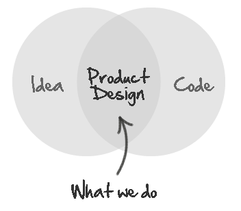
What We Do
Read Blog Post
Read Blog Post
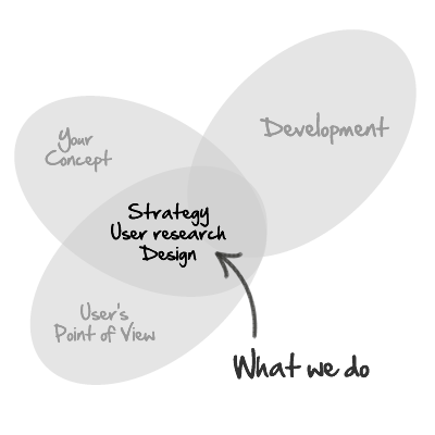
What We Do – Revisited
Read Blog Post
Read Blog Post
Launched: Intuit Health Benefits Shopping
Read Blog Post
Read Blog Post
Pattern: Lazy Registration
Read Blog Post
Read Blog Post

2 SXSW Panel Proposals
Read Blog Post
Read Blog Post

5 Things People Get Wrong When Talking to Users
Read Blog Post
Read Blog Post

6 Stupid Excuses for Not Getting Feedback
Read Blog Post
Read Blog Post

Why I Hate Paper Prototypes
Read Blog Post
Read Blog Post

Improving the ROI for Your User Research
Read Blog Post
Read Blog Post

A Faster Horse - When Not To Listen To Users
Read Blog Post
Read Blog Post
Infographic: How much do employers pay for healthcare?
Read Blog Post
Read Blog Post

Is Continuous Deployment Good for Users?
Read Blog Post
Read Blog Post
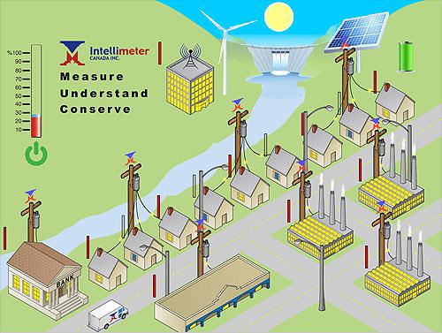
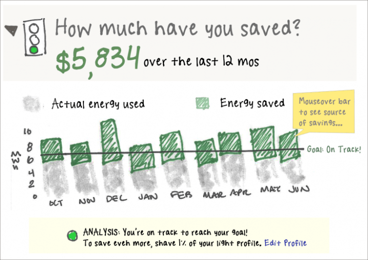
Watts all the buzz about smart grid energy?
Read Blog Post
Read Blog Post

6 Reasons Users Hate Your New Feature
Read Blog Post
Read Blog Post

Which Metrics Equal Happy Users?
Read Blog Post
Read Blog Post
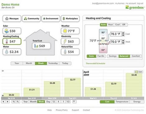
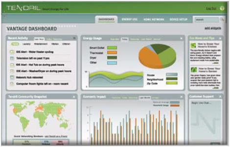
Tips for Improving Greenbox's Energy Portal
Read Blog Post
Read Blog Post
Ten Ways to Improve Your Demand Response Program
Read Blog Post
Read Blog Post
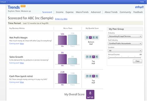
Launch: Intuit Trends Redesign
Read Blog Post
Read Blog Post
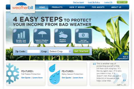
Launch: WeatherBill
Read Blog Post
Read Blog Post
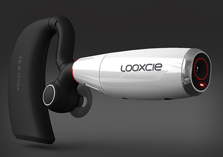
Looxcie Launches!
Read Blog Post
Read Blog Post

Flipboard: A tale of tough choices
Read Blog Post
Read Blog Post

Designing for the iPad: Check Out Our Article in Smashing Magazine
Read Blog Post
Read Blog Post
Healthbeat 2013: IT + UX = :-)
Read Blog Post
Read Blog Post

Saying Goodbye to Carrie
Read Blog Post
Read Blog Post
Forgot Your Password?
Read Blog Post
Read Blog Post
Be Experiment Smart
Read Blog Post
Read Blog Post
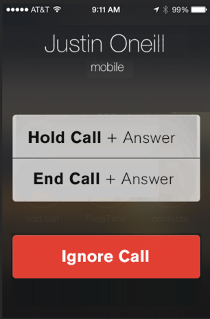
How Apple Broke Call Waiting in iOS 7
Read Blog Post
Read Blog Post
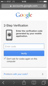
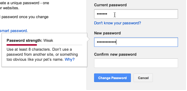
Passwords are Broken. What's Next?
Read Blog Post
Read Blog Post

Our New Managing Design Director Might Look Familiar To You
Read Blog Post
Read Blog Post

Finding the User Testing Sweet Spot
Read Blog Post
Read Blog Post
Meet our 2014 summer interns
Read Blog Post
Read Blog Post
Watch Out for Wearables: Google I/O Recap
Read Blog Post
Read Blog Post
Ditch the Rainbows
Read Blog Post
Read Blog Post
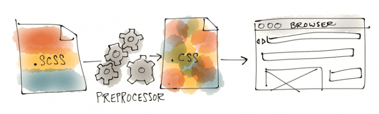
A Designer’s Quick-Start Guide to CSS Preprocessors
Read Blog Post
Read Blog Post
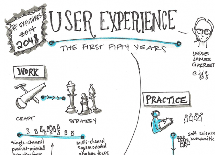
Notes from the Future of UX
Read Blog Post
Read Blog Post

Our Work-Life Balance Is the Best Thing Since Sliced Bread
Read Blog Post
Read Blog Post
Top Healthcare Tech Trends From Health 2.0 2015
Read Blog Post
Read Blog Post

Innovative Health Technology Launches at Health 2.0, User Experience Still Lacking
Read Blog Post
Read Blog Post
Top 10 Design Thinking FAQs
Read Blog Post
Read Blog Post
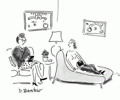
If you're hiring a UX firm, you probably need a therapist
Read Blog Post
Read Blog Post
Part 2: The PRACTICING Design Thinkers’ Top Ten FAQs
Read Blog Post
Read Blog Post
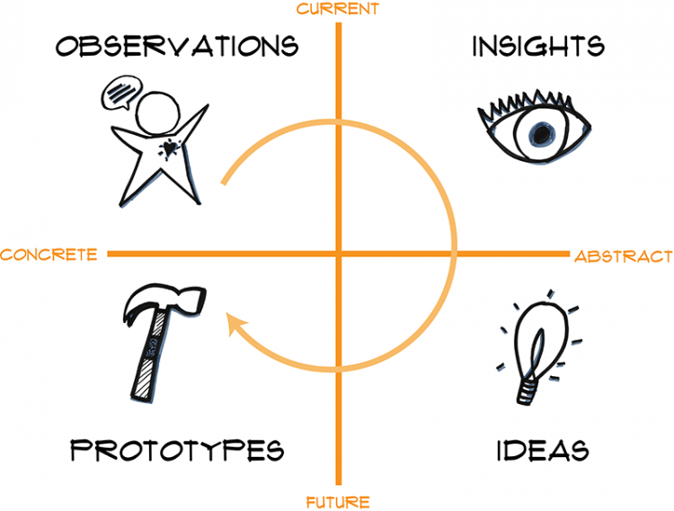
2 minute guide to creating the perfect dashboard
Read Blog Post
Read Blog Post
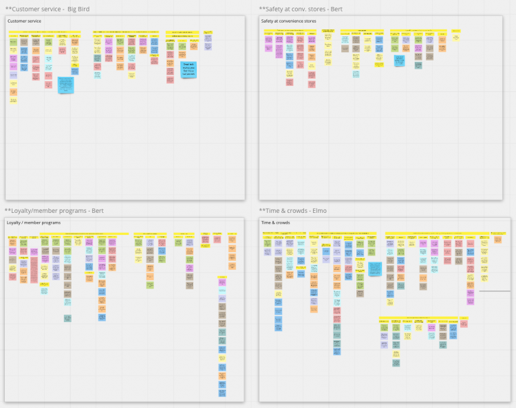
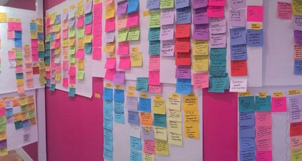
Switching to remote sticky analysis for user research
Read Blog Post
Read Blog Post